Website Makeover: Marsha Zavez
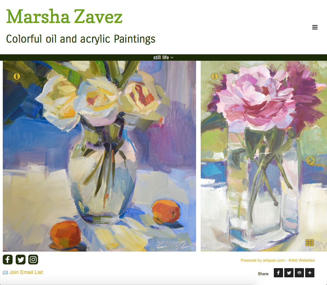
The Final Result
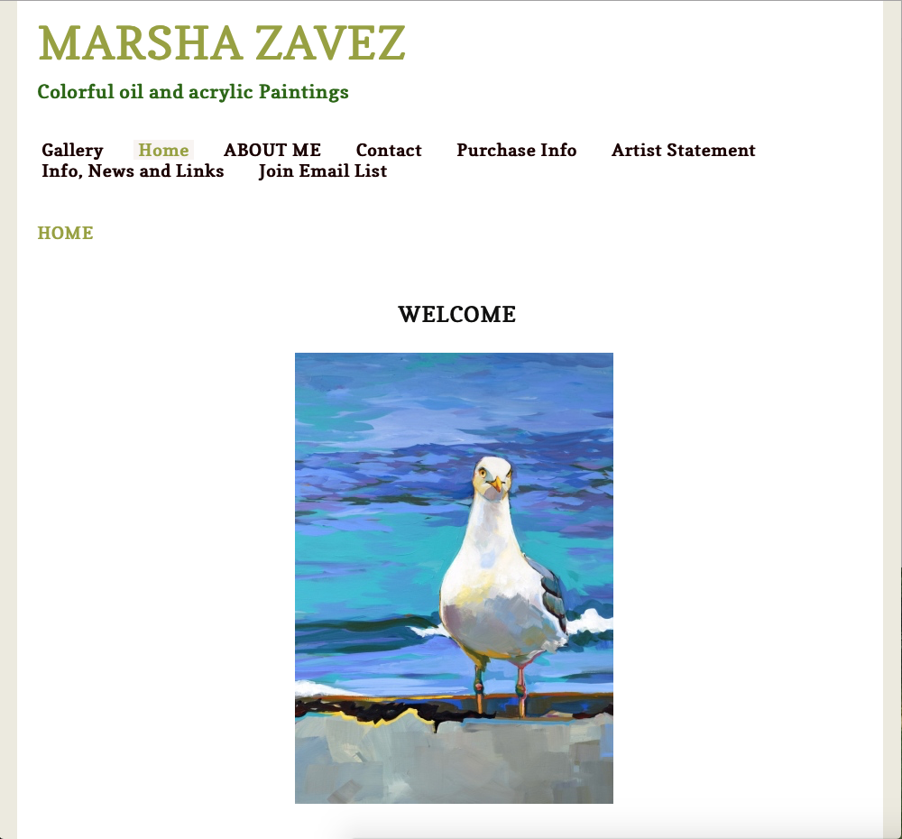
Painting makes Marsha Zavez happy. It's as simple as that for her. That happiness is abundantly visible in the paintings themselves, which are bursting with light and life and color. We love her work, and when we noticed that she was using one of our older templates, we asked if we could update her site. Because her work is so vibrant, and the quality of her images is so high, we thought she'd benefit from using the "panorama" gallery display option, which allows the painting to take up most of the screen. I liked the bright white and green color scheme Zavez was using, but I thought it would look more sophisticated if it was simplified slightly. And I consolidated the fonts throughout the site--it's always best to use only two or three fonts on a site, and to keep the most commonly-used font as simple as possible.
In the end we arrived at a clean, simple design that allows Marsha Zavez's joyful paintings to spread the happiness as widely as possible.
If you would like a website makeover, contact [email protected].

Before
Sign up for our email list
Find out about new art and collections added monthly
