- Welcome to Artspan's Website Makeover! Each month we're going to choose one site to spruce up. Working with the artist, we're going to update the design of the site, and we're going to do a little work behind the scenes to improve SEO. We're going to share the process so that you can see how easy it is to use our design tools, and to inspire you to keep your own site as beautiful as it can be. If you'd like us to consider your site for a design makeover, which will be featured on our blog, in our newsletter, and on social media, contact [email protected].
-
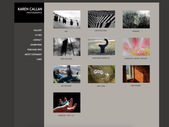
Before
We chose Karen Callan's site for our first makeover because we love her evocative and painterly photographs. She's been too busy to update the site herself, so her site was built on one of our oldest templates. It wasn't mobile-friendly, which means that it would show up clumsily on phones and tablets. So the first step was to pick a mobile-friendly template from the Design section of her control panel.
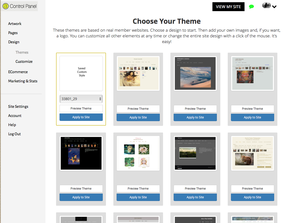
We chose a template with a grey palette to match the original site.

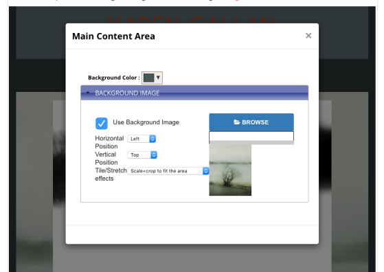
We decided to use one of Callan's photographs to make a background in the main content area. We chose one that wasn't too busy so it wouldn't distract from the gallery thumbnails or any text.
You can add a background image or pattern to any section of your site.To avoid a cluttered look, we recommend that you choose one area, and tailor the rest of the site to match.
Click on the "Customize" tab in the Design section of your control panel. Hover your mouse to see the name of the section of the site you want to fill with a background image. When you click on that section, a box will pop up allowing you to upload your picture or pattern. You can decide to tile your selection or stretch it to fit the area, or, as we did, you can scale and crop to fit the area.
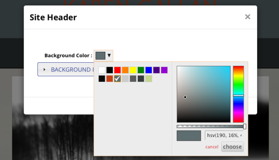
With the background image in place, we decided to adjust the colors of the site header area, the navigation bar, and the site background area to reflect the cooler and warmer grey tones of the background image. To do this, click on the area you want to change, and then click on the color box in the pop up window. You can play around with various colors until you find a pattern you like that suits your work.
Callan didn't have a logo to upload in the site header section, but by choosing a bigger font for her name (which is also the name of her site), and by choosing a color that contrasts with the background, we managed to make the name a focus of attention. Simply click on the site name, and then choose "edit the appearance of this link." You can now change the font, size, and color. To customize the color, click on the box marked "text color," and the palette will appear.
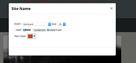
You can choose a more elaborate font for the site name, but we recommend that you choose a simple font for the navigation bar items and any text on pages.
Feel free to play around with various colors and fonts. You can always change the design with a click of the mouse. Your design will be saved in the themes section as a "saved custom style," so you can return to it at any time.
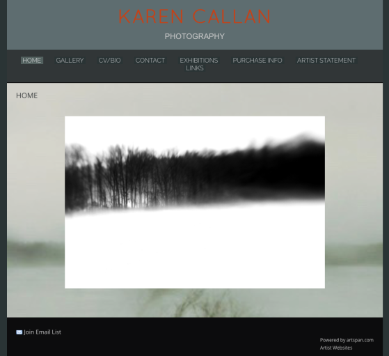
With the basic design of the site in place, we decided to add a home page.
In your control panel, click on "Pages." You can then drag any page to the top to make it "live." You can also drag the page icons to rearrange the order that they appear on your site. We experimented with a variety of Callan's photographs before we decided on the beautiful "Winter Woods." It fits nicely in the horizontal space, and contrasts nicely with the background image. It's also an image that works now, in this season, and Callan might decide to change it for something more colorful in the spring or summer. It's a good idea to change the image on your home page from time-to-time, to reflect what's new in your work, and to keep your site looking fresh.
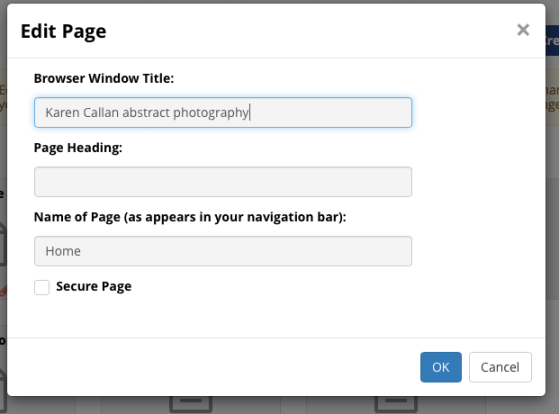
We decided that the page headings are redundant, because the navigation bar tells you which page you're on. To erase them, simply click on the word, erase it, and click "save."
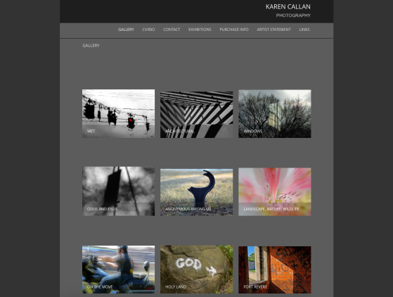
One final change that we made, design-wise, was to choose to have the gallery titles overlaid on the gallery thumbnails.

This helps the thumbnails to line-up on the page, and it makes the titles more easy to read if you've added a background image to your site.
BEHIND THE SCENES: SEO
With the Design aspect taken care of, we took a look behind the scenes to help Callan attract search engine traffic to her site, and to be sure she was showing up on searches of Artspan's home page.
In "site settings," we added some keywords to her site. Remember that Website Name and Description of Work will show up on your site header, but the keywords will not be visible to visitors to your site. We recommend that you fill out all of the boxes in the settings section, and add a picture and some information about yourself.

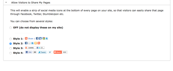
In marketing and stats, we "turned on" the pinterest and Facebook "like" buttons, and added a bar so that people could share Callan's work on a wide variety of Social Media platforms. Increasingly, this is one of the most important ways to get your work out there.

Finally, we added a few descriptive keywords to the browser title window for each of Callan's pages. These won't show up on the site itself, but they will attract search engines. To add keywords, click on "pages," then the "gear"symbol, to edit page settings. We recommend that you add a couple of different, specific keywords to each page. As you see here, the Page Heading is blank because we erased the name of each page when we were working on the design.
And that's about it! If you need help making any changes to your site, consult the detailed tutorials in the "help" section, or contact us at [email protected].
Sign up for our email list
Find out about new art and collections added monthly
